I finished my first entry for the CGHub challenge "Fairy Tales reinvented", that quickly became an entry for the Art Order challenge as well, with Schindehette's permission.
I chose the Frog Prince tale, but I didn't really reinvent it, I just once again focused on little symbols and hidden meanings, naughty humour and such. Nothing that the tale itself doesn't already implicitly represent.
That's why I think it suits the ArtOrder challenge much more than its CGHub counterpart and I'm now drawing an Alice in Wonderland reinterpretation for that.
Anyway, here's the Frog Prince.
Original height is a little over 6000 pixels. The entire illustration was fairly straightforward and smooth except for the girl. I redrew her completely at least 3 times, due to anatomical problems and such. As usual I never start with reference. I adopt it through the process if necessary.
Since I have the "bad" habit of picking weird angles I had to use some reference for the head and shoulders, but had to make the rest up.
Hands are based on reference too (my own hands) for realism and style purposes.
Since I start moving more and more towards realism I notice my need for reference is gradually increasing, but I will never start anything with reference. Whenever I did that I noticed it killed my vision of the piece, it constrained me to what I was seeing in the reference, becoming a true obstacle.
I also don't particularly like how something entirely based on reference looks like. It feels like it's not my own work, it feels alien and depressing.
The least reference I use the best it is for me. These are personal choices and I disagree with those who promote using reference whenever we encounter a little problem.
Our memory is filled with precise images of the entire world, we just don't have access to it with great lucidity, but it's there. We can train to access it and to refresh those memories though.
First I try to figure out what I've done right. Once I know why I've failed on what looks bad I look for help (opinions, reference).
If we don't give ourselves the chance of failing through research we'll always be reference-slaves. It's good to research and experiment when doing personal work or contests with generous deadlines (most are).
05 July 2011
29 June 2011
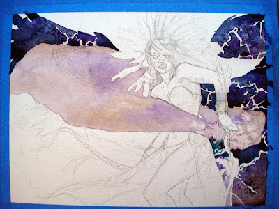
Thundershock Archer WIP
So I am back from Origins Game Fair, and taking a lot of things into consideration after getting some critiques on my portfolio as it is. Along with that talking to some of my buddies and other artists, as well as reviewing a lot of the companies out there, I've come back to focus more on doing the kind of artwork I had set out to do before college and all the fluff involved had their effect on me.
Originally I wanted to work on MTG type of images, so after some thought it was recommended that in addition to creating my own art, that I ought to look at 'reinventing' concepts that already have been done. Above is a sketch on 140lb coldpress (yes, that's right...coldpress, not the type of paper I normally use) Fabriano watercolor paper. I had some other sketches I had done previously in my sketchbook that led up to the actual drawing. It's approximately 8.5x12 inches.
I've sorted out some reference materials as I got ready to finalize my idea, and am kinda sampling some of the colors to create a pallet. Right now I am using a mixture of Viridian Hue, Yellow Ochre, and Windsor Violet. I've been painting with watercolors for a little over three years now, and it's my medium of choice. Along with that it's also lead to me picking up tendencies to favoring the use of particular colors, be it for pigment, or what not. To get a grayed violet I add in a little yellow (complementary colors will do this), and for a darker near black I like to mix green into the violet. I don't often use pure black when I paint.
Right now I am taking a break, as using the cold press paper causes my paints to take a little longer to dry, and I am not a fan of using a blow dryer to speed up the process as I feel it moves my pigment around. Furthermore, I have applied salt in some areas of the painting in a controlled manner, and to use a blow dryer would push the salt around to areas I had not intended to use it.
I know some people prefer to have pristine paints in their pallet, but it's been a habit of mine to muddy up my workable pallet.
It's been nice to jump back into painting, especially as I find that I have been doing digital work more frequently. Right now my biggest challenge is how to handle representing lightning using watercolors....or rather in general. Lightning isn't something that I have painted before, so I am a little anxious as to how this will turn out.
Anyways, I've written quite a lot but figured it would be nice to feature this here...wish me luck on the lightning!
-Kat
27 June 2011
Blowing it out my nose!
So i am working away at this CGHUB fairytale contest and getting frustrated and excited all at the same time.
The fairytale i chose requires me to draw a man, although i have chosen it to be a being, that can blow out his nostrils so hard that he can cause a huge strong wind current. Kinda like superman. :D So here's how he is coming along.
He has a strong tail with horns that, along with his huge toe claws and strong legs. anchor him to the ground so he is not blown away by his own unique skill.
The next drawins will show how he inflates his neck pouch and a back sac to draw in air through his hollow horns on his head and then blows it out his nostril with unbelievable force. The sacs work in synch so that while one deflates the other inflates in readiness.
The fairytale i chose requires me to draw a man, although i have chosen it to be a being, that can blow out his nostrils so hard that he can cause a huge strong wind current. Kinda like superman. :D So here's how he is coming along.

He has a strong tail with horns that, along with his huge toe claws and strong legs. anchor him to the ground so he is not blown away by his own unique skill.
The next drawins will show how he inflates his neck pouch and a back sac to draw in air through his hollow horns on his head and then blows it out his nostril with unbelievable force. The sacs work in synch so that while one deflates the other inflates in readiness.
23 June 2011
Hello & Goodbye
Howdy folks, it's Kat here (aka NerdGirl) posting my first post to Bamboo Bitmap since ya'll allowed me the honor of being a part of this group of art nerds. So I figured I'd post something to kick this off...
 |
| Rolla' Gal: Brushed Ink |
 |
| Little Red Hood: Photoshop |
While I wish I had some more to say or post, I'm also heading out to a convention this weekend in Columbus Ohio....so I look forward to the future posts and viewers to this wonderful little art niche.
-X's & O's
20 June 2011
Ladies of the Night
This originally started as practice for inking and drawing women. It suddenly evolved into a series of illustrations of various types of women: from femme fatales, bad girls to witches, etc. I have a few more to9 finish up but I think I am calling the series “Ladies of the Night”.
I really do enjoy black.
I think I may have a problem.


I really do enjoy black.
I think I may have a problem.


15 May 2011
Eowyn and the Nazgul
I submitted my entry for the Art Order challenge, so it's time to post it here.
It's an allegorical intepretation of the scene, focusing on symbology rather than a literal depiction of the moment.
I looked for inspiration in Renaissance painters like Caravaggio or Bernini's sculptures. I think I've been exposed to those artists more than I ever realized (growing up in Italy) and I like those poses and expressions. I tried to do something along those lines and use very strong darkness and accentuated light sources on the points of interest.
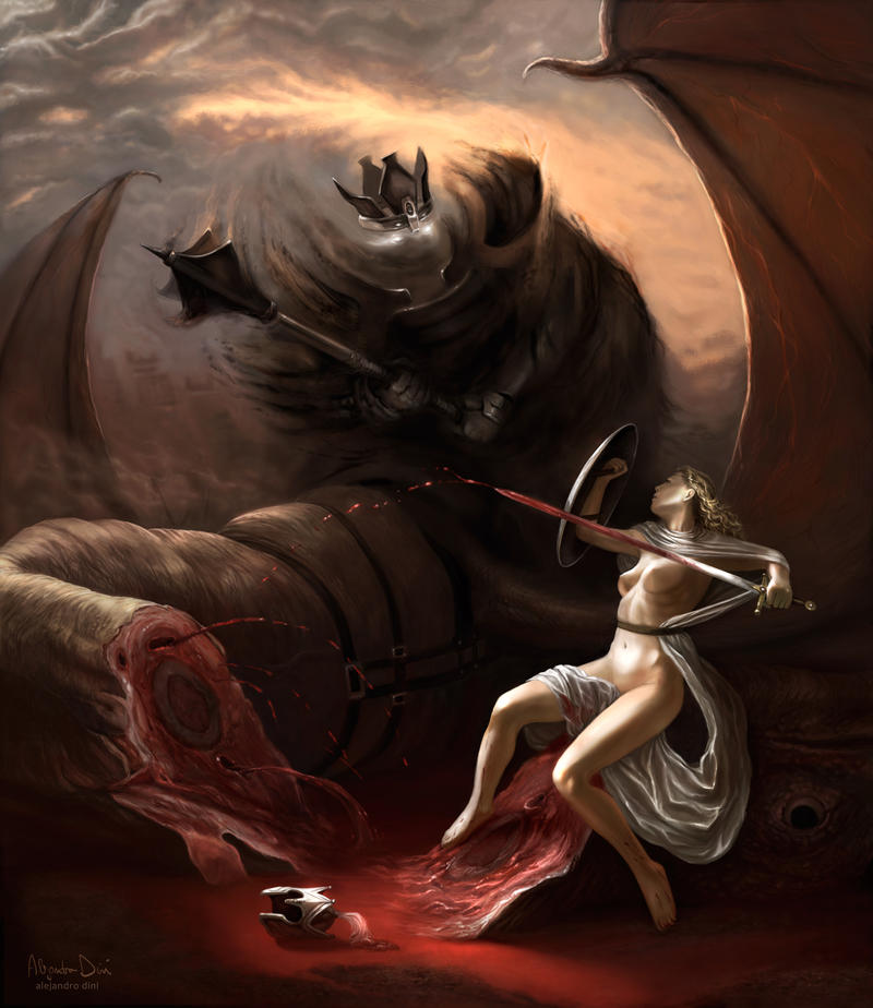
It was really challenging. I changed the Nazgul once, the mace three times and the sky at least twice through the process, not to mention how much I worked on the female figure. I had no straight reference for that, so I had to look at several things, none of which with the correct light source, so I had to make that up. A lot of trial and error.
On the other hand, the sliced volatile was fairly easy.
Final size: about 3100x3600, Photoshop.

11 May 2011
Eowyn and the Nazgul
19 April 2011
Snatchbiscuits
I have been wanting to get theses on the bogs but work has been beating me down. Art-wise it’s a pretty exciting time for me. I am expanding now into coloring my work digitally and no it will be sometime before I post that yet. Right now I am studying values and that is a hate-bucket of moneys right there.
For the last few months it’s been all about light and shadow. I have been practicing more, going back to basics of figure drawing , not to mention trying to learn the Riley method of art. Mostly because of this godsend of a site by John Ennis called The Reilly Papers
If you get a chance go look, the education is worth it.
Now to the posting:
I love Noir and this is one of those shots that tells you why. I don't exactly remember what this was for but I believe it was a comic cover to an indie project I helped out on. The next one was practice inking pages. it is a special skill to ink panels vs. whole splash pages. The only thing about the page I like is that I finished it.


These last two pieces are RPG game art for a fantasy world.


Hope you likes see you on the flipside.
For the last few months it’s been all about light and shadow. I have been practicing more, going back to basics of figure drawing , not to mention trying to learn the Riley method of art. Mostly because of this godsend of a site by John Ennis called The Reilly Papers
If you get a chance go look, the education is worth it.
Now to the posting:
I love Noir and this is one of those shots that tells you why. I don't exactly remember what this was for but I believe it was a comic cover to an indie project I helped out on. The next one was practice inking pages. it is a special skill to ink panels vs. whole splash pages. The only thing about the page I like is that I finished it.


These last two pieces are RPG game art for a fantasy world.


Hope you likes see you on the flipside.
Labels:
Art,
Fantasy Art,
Frank Reilly,
inking,
John Ennis,
Noir,
Philip Jean-Pierre,
The Reilly Papers
27 March 2011
The Fanatic
Hi everyone,
this is my first post here, so I'll briefly introduce myself. I'm an alien with italian passport, currently living and working in Hong Kong drawing stuff for kids.
After years of this I clearly became more and more mentally unstable, which led me to release my tensions through fantasy and creepy digital paintings in my spare time.
My portfolio and blog is at www.creationspot.com
This is my latest digital painting, titled "The Fanatic".
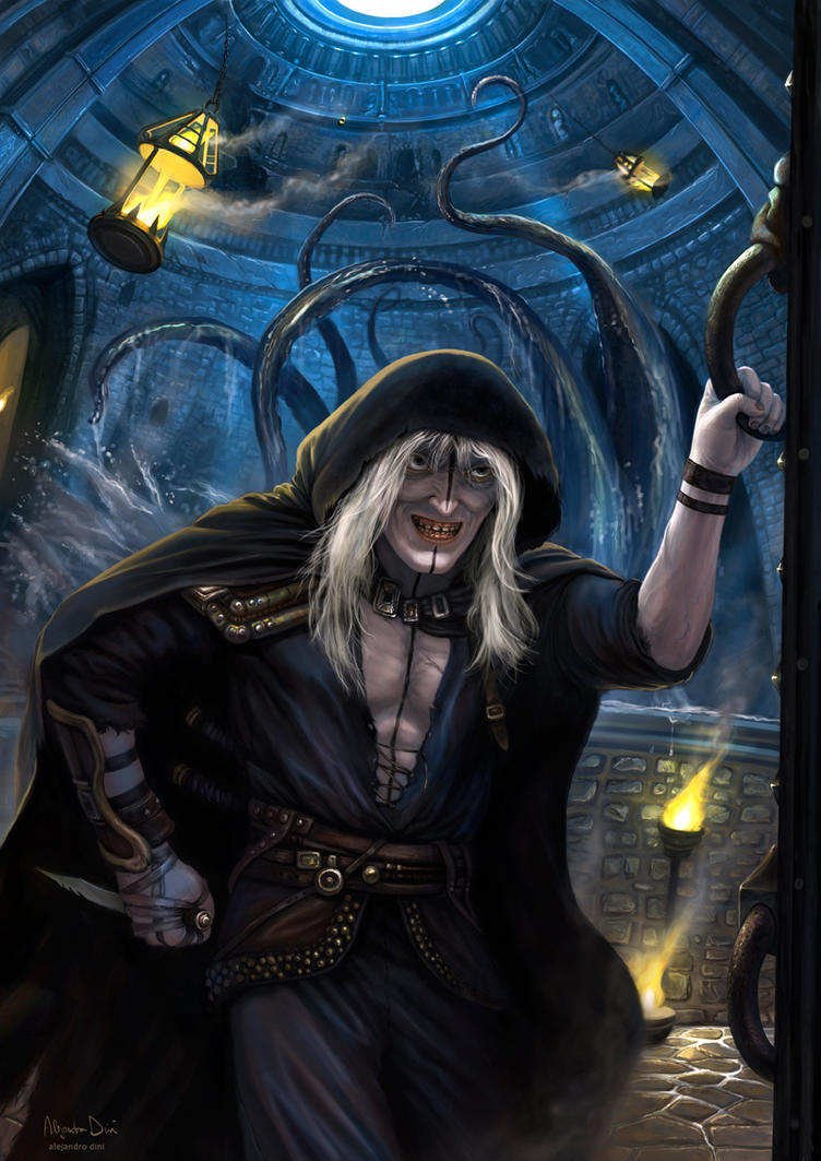
I'll show you the process, just in case you're curious.
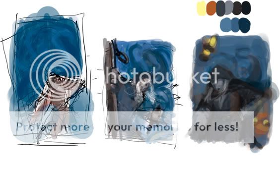 I started with the usual round of thumbnails.
I lost the final one, because it quickly became the actual painting itself, but you can see some of the early stages of the concept.
I wanted to portray a member of some creepy sect venerating a tentacular godly being.
These are more or less the WIP stages, but the actual process has been more troublesome than what appears to be here, because I thought I had finished the painting while it was still clearly rough and undefined. That's what stress can do sometimes.
Getting feedback from people helped me as a cold shower and I realized I still had tons of work to do and I finished it.
 As usual, I had no reference to start with. I tend to work without figure reference from the start and if necessary I collect it through the process if I find myself stuck.
In this case I badly needed something for the background and I couldn't find anything like that.
I found photos of cathedrals and such. They helped a bit but I still had to figure out everything by myself, perspective and angles included.
It was a pain for a while, but since I usually have trouble with architecture I guess I'm quite happy with the result and I hope I'll be more confident next time.
My focus of interest is always anatomy and figure, but it's good to practice on other things occasionally.
this is my first post here, so I'll briefly introduce myself. I'm an alien with italian passport, currently living and working in Hong Kong drawing stuff for kids.
After years of this I clearly became more and more mentally unstable, which led me to release my tensions through fantasy and creepy digital paintings in my spare time.
My portfolio and blog is at www.creationspot.com
This is my latest digital painting, titled "The Fanatic".

I'll show you the process, just in case you're curious.
 I started with the usual round of thumbnails.
I lost the final one, because it quickly became the actual painting itself, but you can see some of the early stages of the concept.
I wanted to portray a member of some creepy sect venerating a tentacular godly being.
These are more or less the WIP stages, but the actual process has been more troublesome than what appears to be here, because I thought I had finished the painting while it was still clearly rough and undefined. That's what stress can do sometimes.
Getting feedback from people helped me as a cold shower and I realized I still had tons of work to do and I finished it.
 As usual, I had no reference to start with. I tend to work without figure reference from the start and if necessary I collect it through the process if I find myself stuck.
In this case I badly needed something for the background and I couldn't find anything like that.
I found photos of cathedrals and such. They helped a bit but I still had to figure out everything by myself, perspective and angles included.
It was a pain for a while, but since I usually have trouble with architecture I guess I'm quite happy with the result and I hope I'll be more confident next time.
My focus of interest is always anatomy and figure, but it's good to practice on other things occasionally.
18 March 2011
Hi!
16 March 2011
As they begin to rise again
So I have been totally awed and saddened by the events in Japan and pissed by some of the fanatic rhetoric coming from some cray-cray muthasmurfers (my term for crazy) that seems to be heaped up on the people of Japan.
I was doing some brush work practice. And found myself doing some sketches inspired by the tsunami. These were done more stream of consciousness with no plan in mind but I was pleased with the result.
Of the batch I did there were the only two that made any kind of sense. I did a little clean up and included a Basho Poem in Photoshop.
As they begin to rise again
Chrysanthemums faintly smell,
After the flooding rain
Matsuo Basho
Hope you like.


13 March 2011
Locus Focus


You like that title? :) Just thought of it. Yes, i do entertain myself quite easily.
Locus is an online comic by Adam Black (who may or may not be reading this) and it a great read and inspiration to myself. I never really do fan art but for all the encouragement that Adam gives me by being so dedicated and just plain cool, i thought it might be nice to give him a nice piece.
I am hoping this will look awesome in the end. Still a few things to work out, in the drawing as well as the colours (which is quite obvious).
Also am i stoked about the posts we are actually making in this blog or what? :)
-PJ
Keep the child alive...
Blog
Labels:
Adam Black,
colours,
illustration,
inks,
Locus,
web comic
09 March 2011
Getting into the game!
I did a lot of work in Jan and Feb. The major difference is that I am crazy motivated due in no small part to Francis Vallejo.
I picked up the inking demo/instructional video he did through The Art Department
It was good advice, a discussion on art and using ink, the tools and what you should look for and think wile working. The best part it also teaches you to illustrate with ink, not ink someone else. I love inkers but as an illustrator this video and the approach it taught me to my work, was incredible. A lot of y resistance came from my fear of ruining a piece because of bad inking. A valid one to be sure but I was so terrified I was shooting myself in my foot.
No, he is not paying me unless you count the education.
Yeah I am overly excited and its been a long time since I could say that.
Honestly something clicked and since I looked at that video I am illustrating and with ink and using ink without fear. Its a sickness. It’s a 28-DAYS LATER style sickness. A lot of the new stuff is my inking. Is it good? I look at it and cry but I keep pushing which is what we are supposed to do. I don’t know if in my old age, knowledge is getting through but I am not afraid of inking my work. If I fuck it up AND I WILL, then crap that sucks but it doesn’t hold me back. I say screw it and move on and do better.
So this new work is me trying to get there. I still need patience and as crappy as my inks are I am seeing something what that is I don’t know, but hell like Wesley Snipes says, "Even the sun shines on a dogs ass once."
Here’s to some more sunshine.
Enjoy the art:


Subscribe to:
Posts (Atom)


